As product coverage expands, there’s a natural tension between going deeper into a category and covering more ground across it. Both approaches add value, but they serve different purposes.
Some pages benefit from showing a wide range of options across merchants and product types. Others work better when they focus on a smaller set of well-defined products. Finding the right balance is less about maximizing coverage and more about supporting how the page is meant to be used.
Start With What the Page Is Trying to Do
The purpose of the page should guide how much depth or breadth it needs.
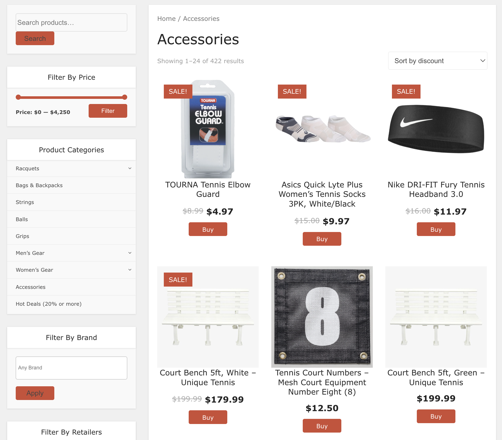
On broader, category-level pages, wider coverage helps visitors explore. Showing a variety of products across merchants gives a clearer picture of what’s available. In these cases, breadth adds value by expanding visibility.
On more focused pages, depth often works better. If the goal is to help someone compare or choose, a tighter set of products allows for more meaningful evaluation. Too much variety can make it harder to see differences and slow down decision-making.
Avoid Mixing Too Many Directions
Coverage becomes harder to follow when a page tries to do both at once.
If a Product Set includes a wide range of product types, price points, and merchants, it can feel scattered. Visitors may need to do more work to understand how options relate to each other.
Keeping coverage aligned, whether broader or more focused, helps the page feel more intentional. It reduces the need for visitors to filter mentally and makes the experience easier to navigate.
Let Structure Create Balance
You don’t always have to choose one approach over the other. In many cases, structure can help you support both.
For example, one Product Set can provide broad coverage at a high level, while additional sets break things down into more focused groups.
This allows visitors to explore and then narrow their options without overwhelming them upfront.
Separating coverage this way keeps each section clear while still offering flexibility.
Keep Coverage Intentional
More coverage isn’t always better. What matters is how well it fits the page.
When depth and breadth are balanced thoughtfully, product pages feel both complete and easy to use. Visitors can explore when they need to and focus when they’re ready to decide.
The goal is not to show everything. It’s to show enough, in the right way, to help visitors move forward with confidence.
To learn more, view documentation here.